Building a design system from scratch
Creating a common design language for Catawiki across different channels, platforms and teams.
Company
Catawiki
Role
Design Lead
Platform
Web + Native
Date
Jul 20 - Oct 20
The problem
Catawiki, prior to its brand revamp, lacked any formalised design system. Components existed on the platform as separate identities with individual teams creating their own source of standards for UI elements. This led to:
Conflicting guidelines and direction
Duplication of common components
Siloed teams working with disjointed communication
Inconsistencies across pages
A disconnected user experience
The challenges
Setting the reach of the design system
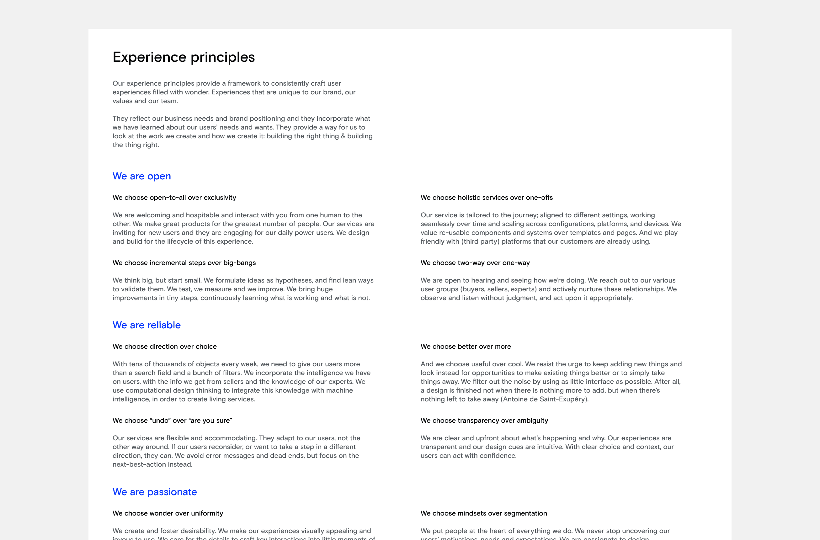
Building a design system from scratch required more than just a traditional style guide. We aimed to create a single source of truth encompassing all design components, patterns, and code, accompanied by thorough documentation.
Our goal was to empower designers and developers to construct new compositions using pre-defined building blocks inspired by atomic design principles.


Aligning and managing stakeholders
To ensure success, we needed to get all teams aligned and invested in the design system. Leveraging the excitement around the rebranding, we initiated a series of meetings involving representatives from different teams. These discussions allowed us to gather feedback, prioritize requirements, and build a design system tailored to the company’s specific needs.
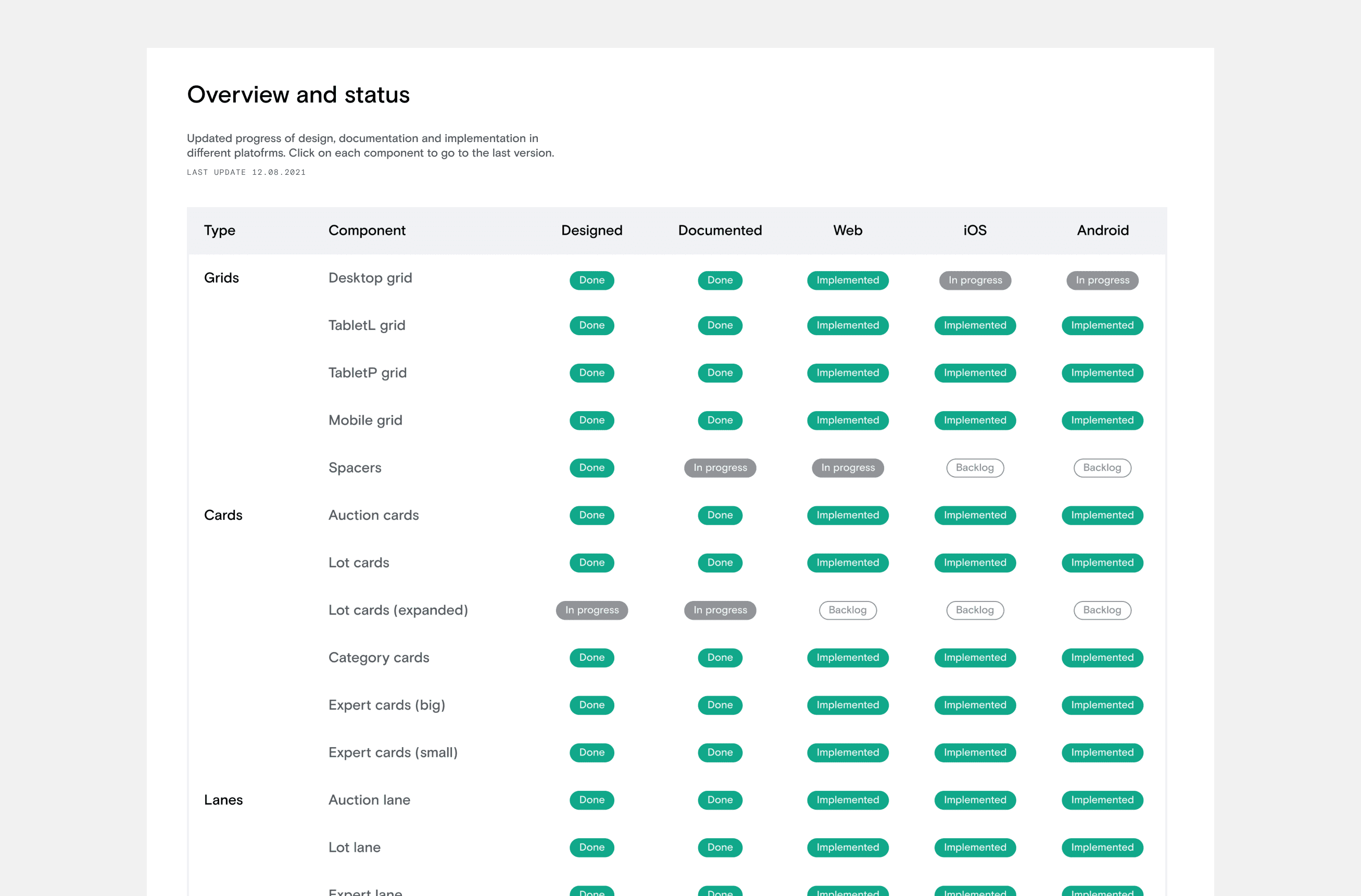
Keeping the process up to date
As a single source of truth, it is very important to continuously update the status of the project. As a design system designer, I played a different role than those who focused solely on individual projects, by having the bird’s-eye view of all the different components that the company was using. We approached this by implementing an open-source approach, enabling transparent access to the system’s progress.
It could have been easy to just focus on the direct results of creating a complete collection in Figma. But we had to keep an eye on the real prize: aligning all the work with the development team by creating a beautiful, flexible and reusable collection of components that can be used to build real software.
The process
Establishing the foundations
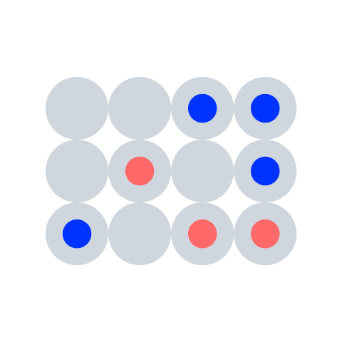
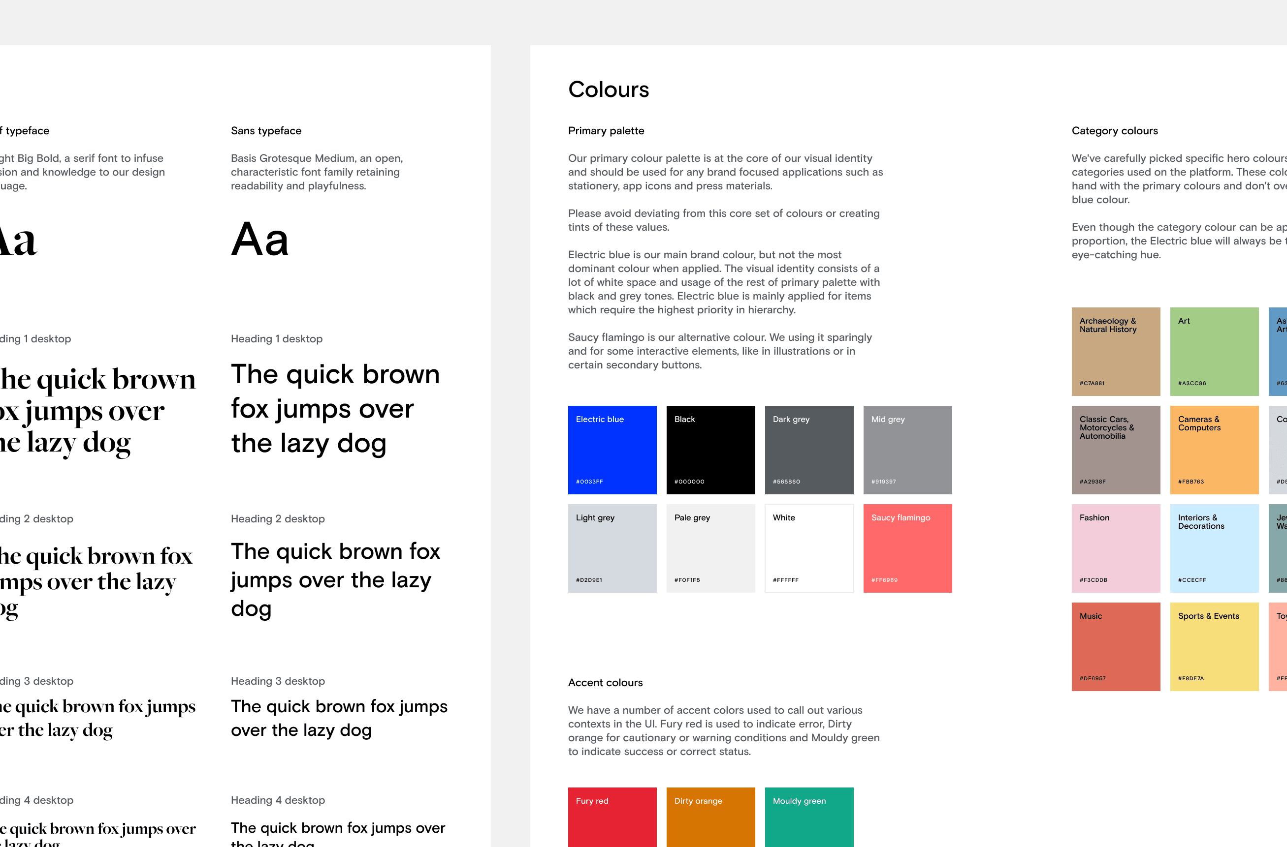
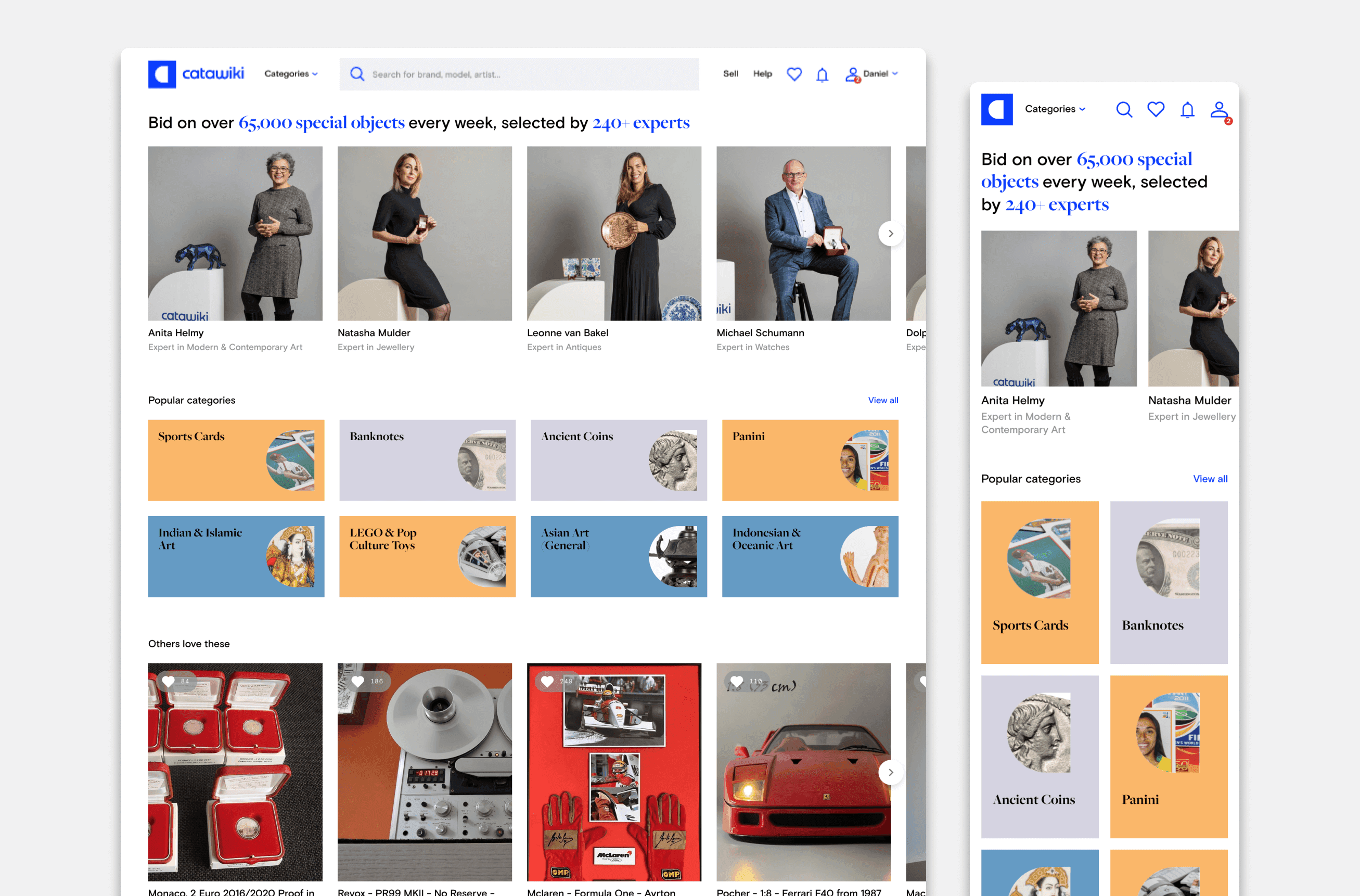
We laid the foundation by defining brand logos, grids, spacing scales, typography styles, and colour palettes.
Typography styles were categorised based on font combinations, allowing for different usage scenarios. Our colour palette consisted of a primary colour (electric blue) at the core of the visual identity, an accent palette for maximum contrast accessibility, and an extra palette of carefully picked specific hero colours for the main level categories used on the platform.
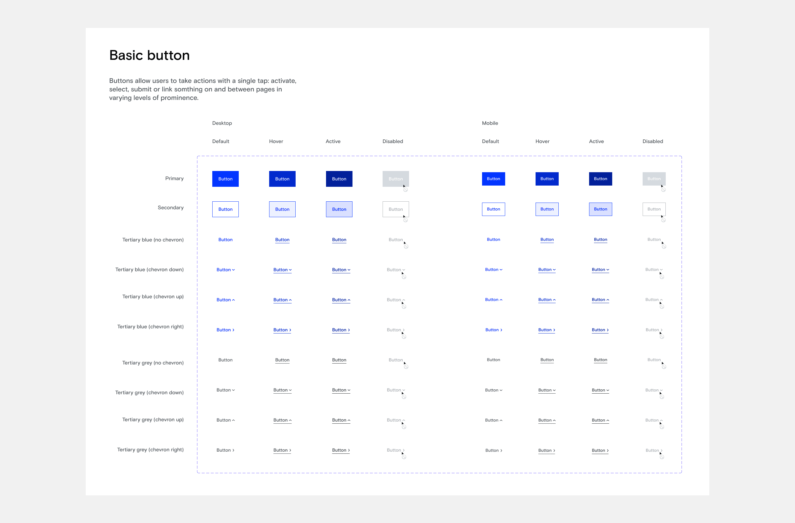
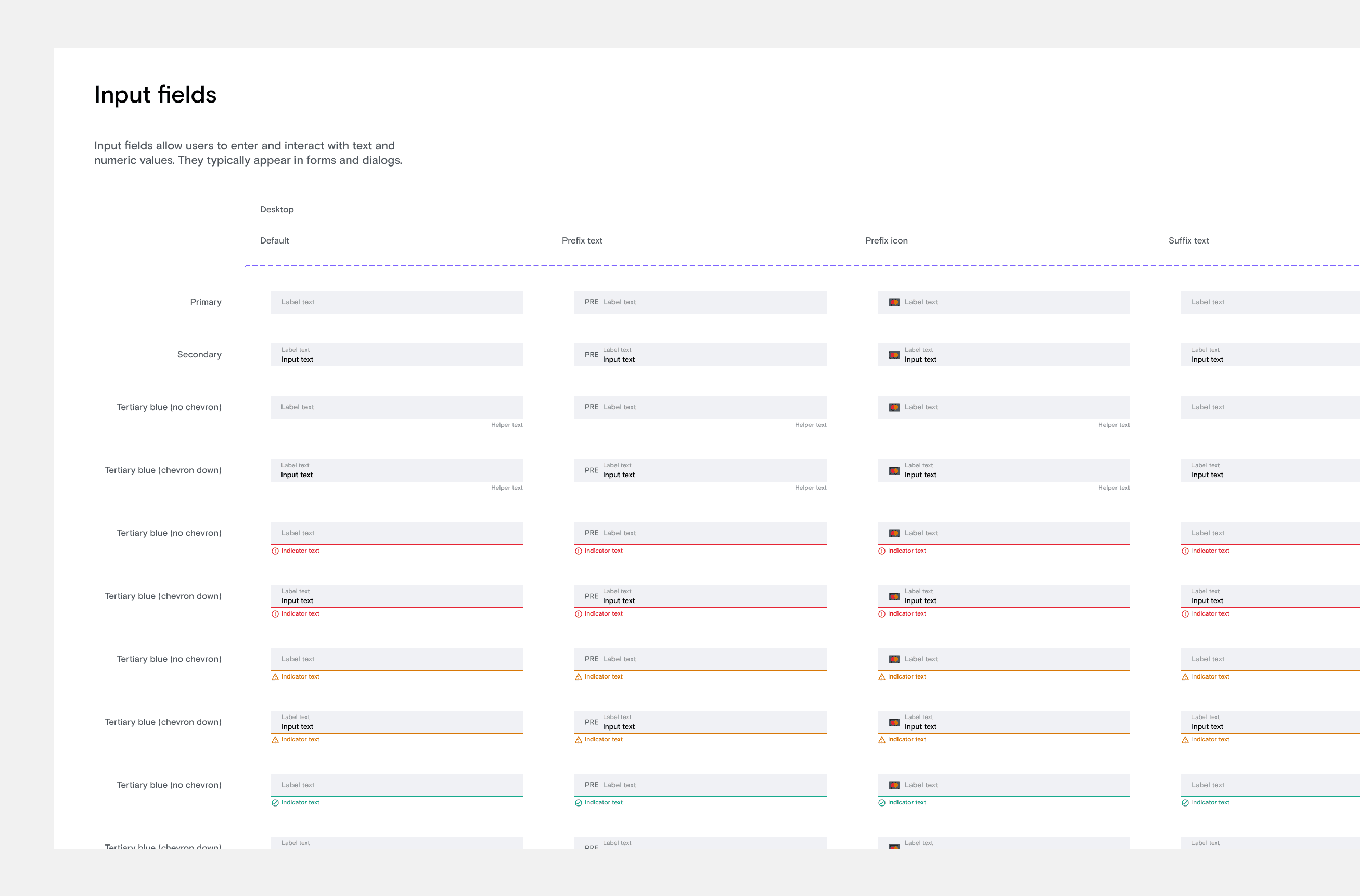
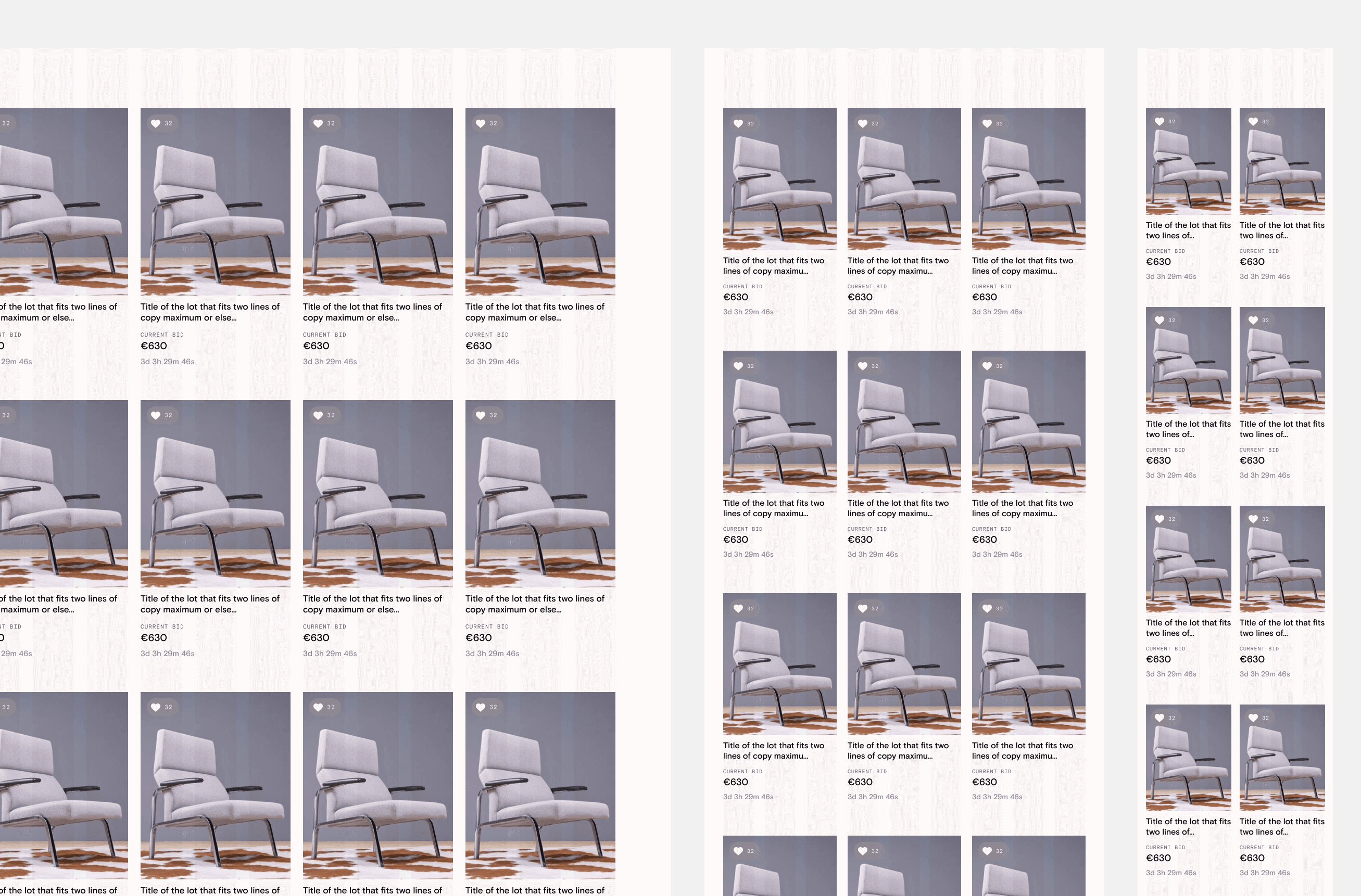
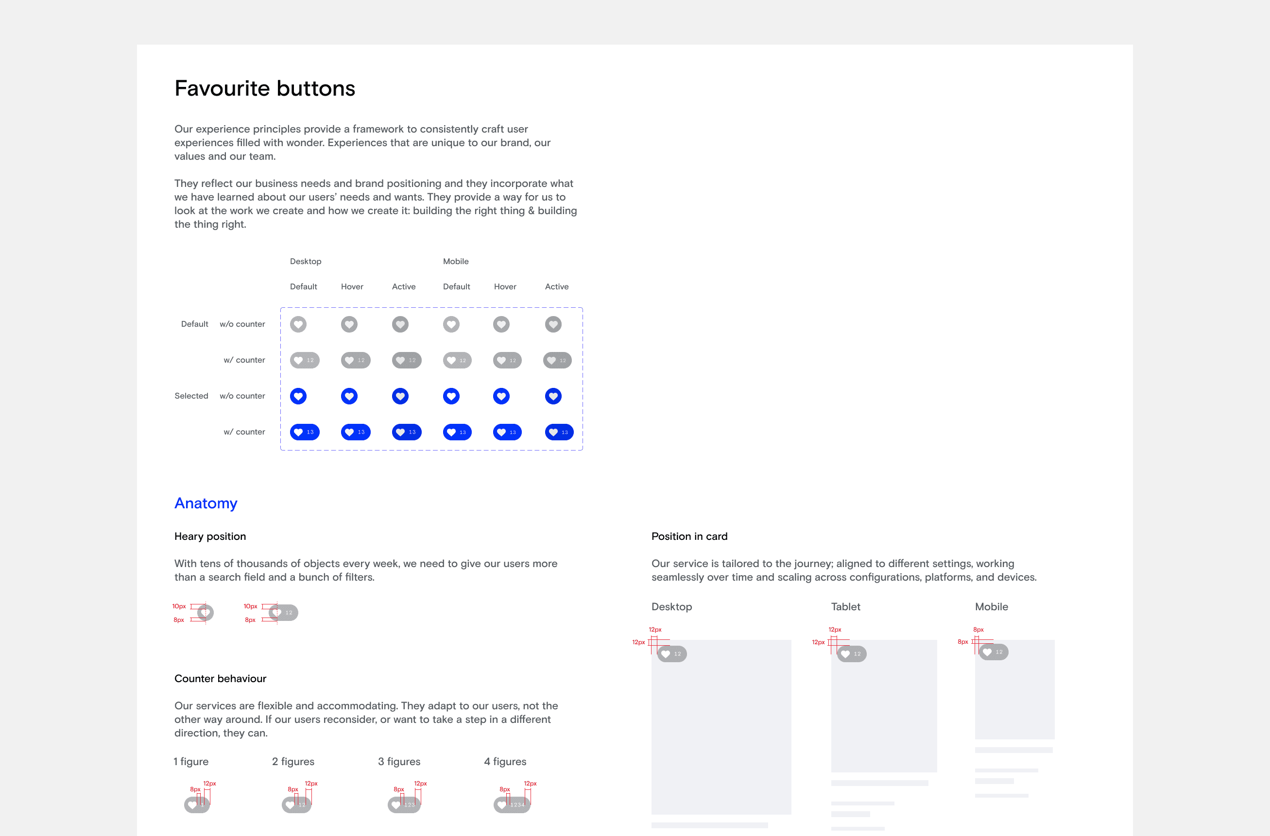
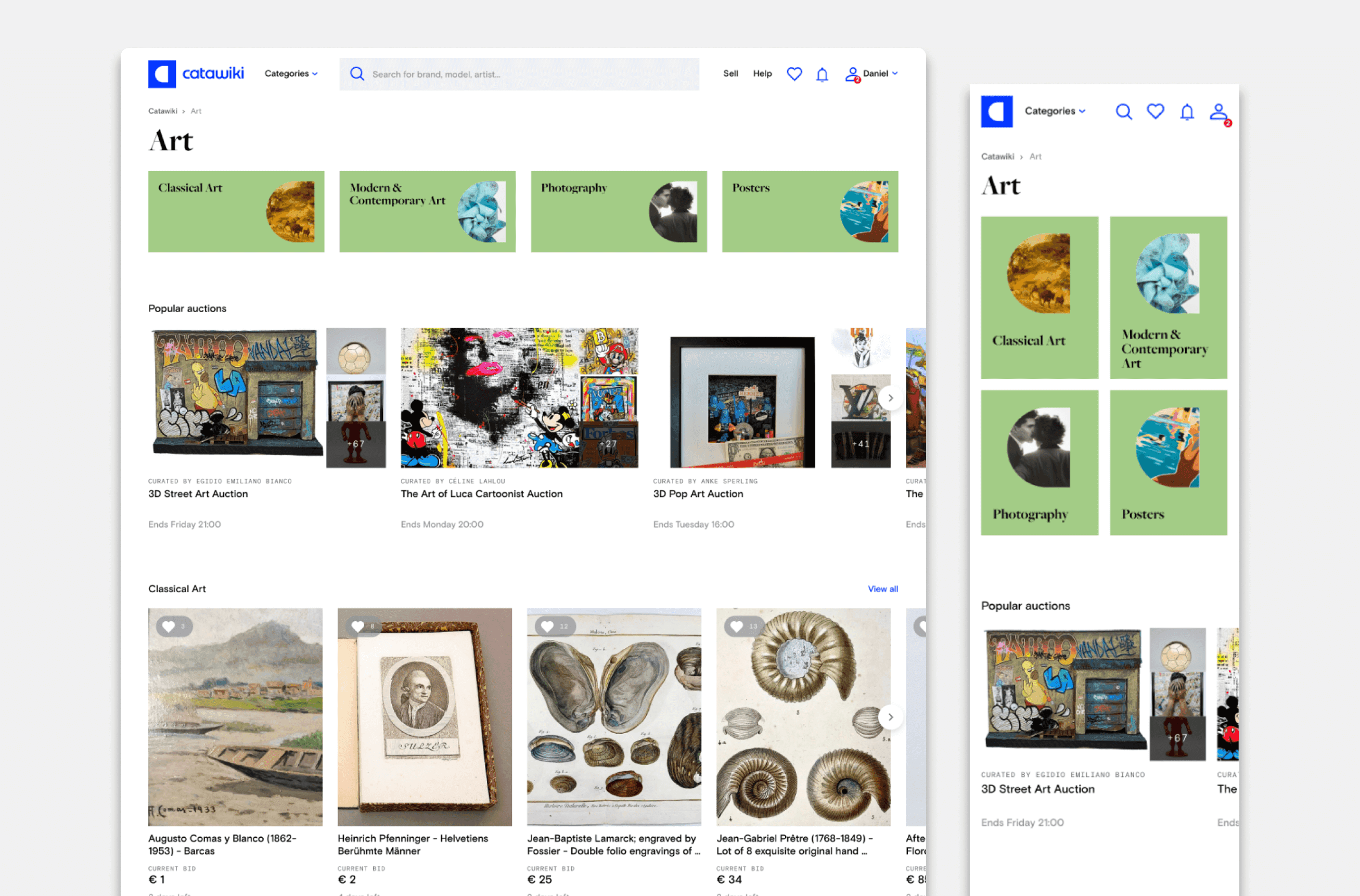
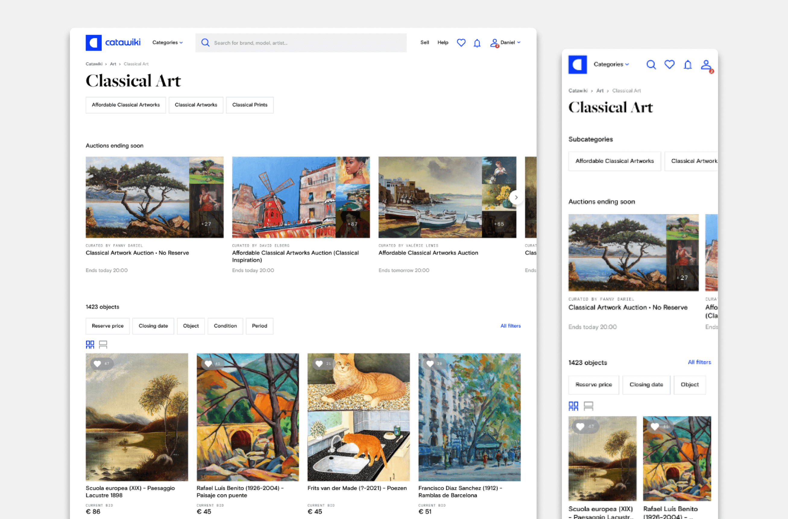
Building the component library
The component library is a collection of reusable interface elements, all themed according to the established foundations. We categorized components such as cards, lanes, and notifications, enabling efficient and context-aware design decisions. Each component was accompanied by stepped interaction examples, illustrating expected interactive states. Additionally, we refined the components to accommodate various breakpoints and content specifications, providing clarity to content authors regarding minimum and maximum content allowances.

Documentation
A design system is never finished; it needs continuous improvement. Our UX team understood the importance of documentation for the system’s success and sustainability. We aimed to provide clear insights into the thought processes and decision-making behind the design system, allowing stakeholders and users to continuously improve it. Documentation became an integral part of our process, ensuring that anyone joining the team could easily access component details, understand their history, changes, current status, and version.
Working collaboratively with designers, writers, and developers, we created and maintained documentation resources, which included our design principles, quick start guides, and best practices, enabling everyone to align with the design system’s guidelines.
The outcome
Through our combined efforts across different teams, we successfully built a comprehensive design system from scratch. By utilizing Figma as the design tool and implementing the system in code, we achieved speed, efficiency, and consistency in our work, allowing for more time and space to focus on the real problems and challenges.
My learnings
Reflecting on our achievements and lessons learned, I gained valuable insights from this project:
Design systems are living entities that require a dedicated team actively involved in their growth and maintenance. Continuous improvement and adaptability are essential.
Facilitating adoption and achieving cross-team buy-in may present challenges, but they are worthwhile efforts. By establishing a common design language, we create familiarity and consistency for all individuals interacting with the system.